Logo Design & Brand Guide
ロゴデザイン.ブランドガイド
Product: Cathay United Bank - CMA program
Role & Scope
Logo Design & Brand Guideline: Steffi Huang
CUB Brand Executive: Polly Hsu
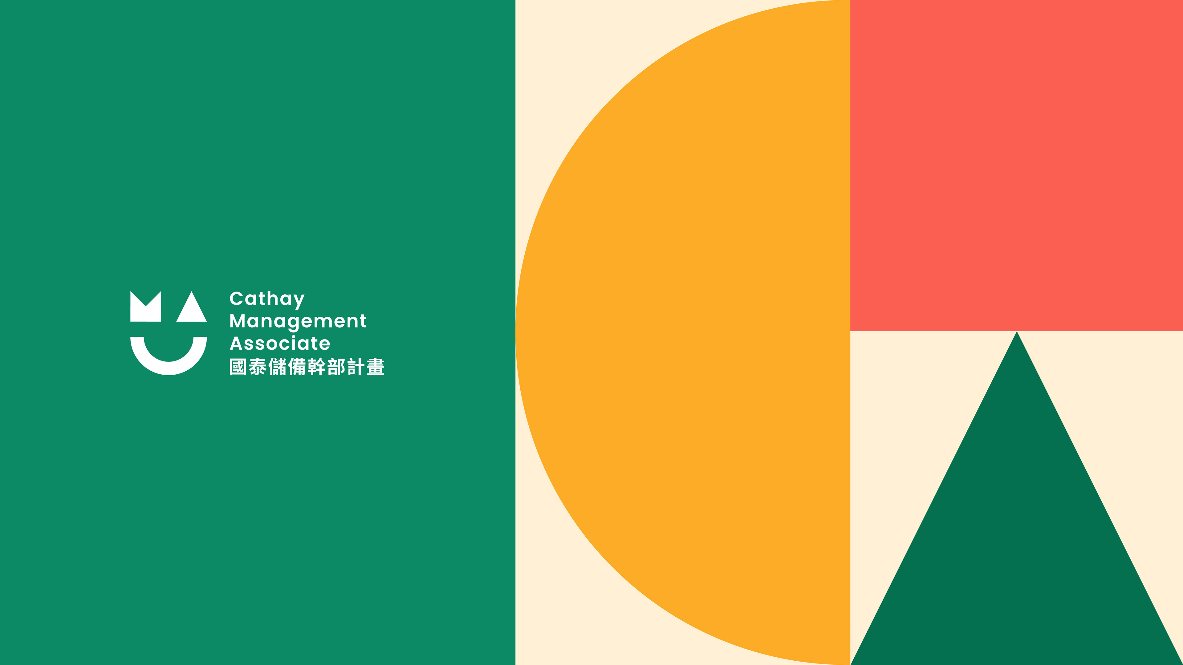
CMA is an abbreviation of “Cathay Management Associate”.
The CMA Program, launched in 2005, focuses on molding its trainees into financial experts with a comprehensive view and the ability to resolve issues and has produced over 100 graduates.
CMAは「Cathay Management Associate」の略称です。2005年に開始されたCMAプログラムは、問題解決能力を備えた金融専門家の育成に重点を置いており、これまでに100名を超える卒業生を輩出しています。
From Concept to Creation
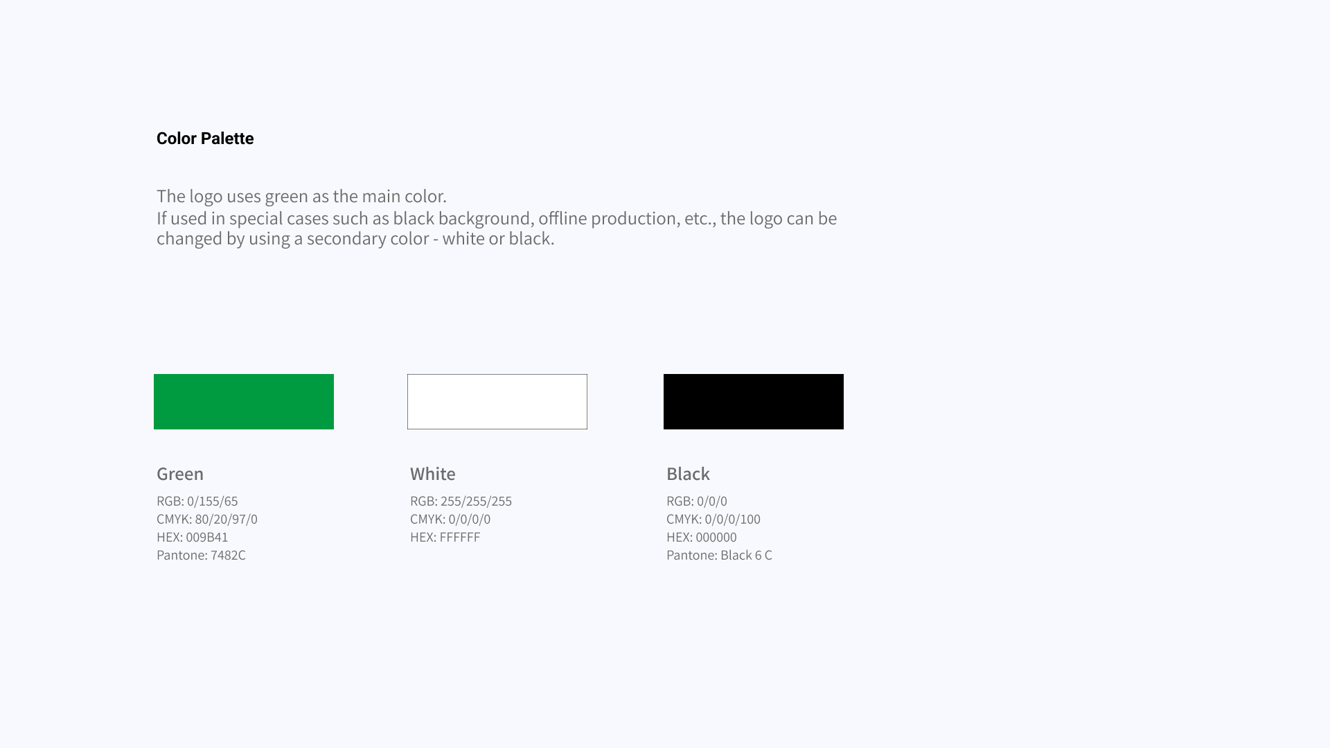
The challenge is finding a balance between maintaining consistency and embracing diversity. As a trainee project with Cathay United Bank, we ensure that the color tone and overall visual impression align with the main brand while also developing its unique identity.
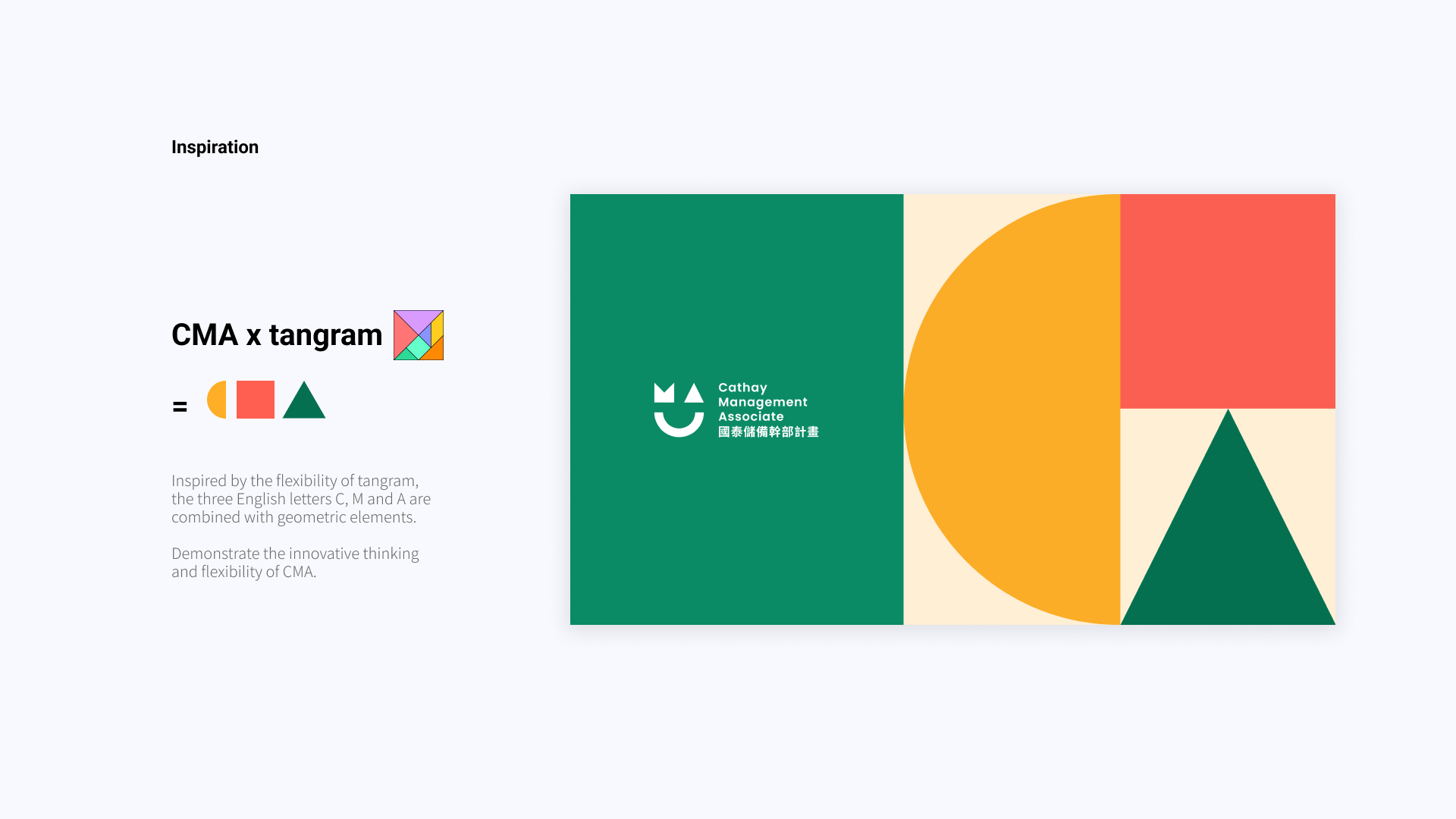
The core objective of the CMA project is to enhance leadership skills by engaging with a diverse range of individuals. Trainees will rotate through different departments and discover their areas of expertise. Drawing on this flexibility, I chose 'tangram' as a visual inspiration. It symbolizes the ability to adapt to various changes and work towards becoming their ideal self.
課題は、一貫性を保ちながら多様性を受け入れることです。Cathay United BankとCMAプロジェクトでは、色調と全体的なビジュアルイメージを調和させつつ、独自のアイデンティティを構築しています。
CMAプロジェクトの中心的な目的は、多様な人材と関わることでリーダーシップスキルを向上させることです。研修生は様々な部署をローテーションし、それぞれの専門分野を発見します。この柔軟性を活かし、私は「タングラム」をビジュアルインスピレーションとして選びました。これは、様々な変化に適応し、理想の自分を目指して努力する能力を象徴しています。